Introduction
Let’s assume, for the sake of discussion, that you’re like me. You spend 12 hours a day in front of your computer, and if you didn’t have to eat and sleep, you would probably spend all day. Maybe you started feeling some soreness in your lower back after long coding sessions. Maybe you’ve got a techie friend who lived in front of his computer and is now struggling with debilitating back pain, even though he’s not even 40. You’re wondering what would happen if your back problems rendered you incapable of working on your computer.
You are probably right to worry. Once you break (herniate) an intervertebral disc and have the gooey stuff bulge out, the disc won’t un-break itself. Although the pain may go away, it can always come back when you make the wrong movement with your spine. And back pain is no joke. Imagine pain so bad that you cannot do any kind of work, move around, or even think of anything other than the pain. Back pain can make you feel like your life has been shattered and plunge you into an existential crisis.
In this FAQ, I have compiled a list of questions and answers which represents my current understanding of the topic. Please note I am not a medical professional. All I know comes from my personal research, my limited experience with back exercises, and conversations with specialists (physical therapists, orthopedic surgeons). My primary book references were Low Back Disorders and Back Mechanic by Stuart McGill, professor of spine biomechanics at the University of Waterloo.
This FAQ is about prevention. If you are in pain, you should probably consult a specialist. You might also want to read Back Mechanic, which describes ways to diagnose your particular back pain, learn movement patterns that avoid aggravating your pain points, and exercise to enable proper muscle support.
How exactly do you get back pain?
Your spine is made up of bones (vertebrae) with gel-like discs sandwiched between them. When one of the intervertebral discs breaks (herniates), the gooey contents bulge out and start pressing on the nerves that run along the back of the spine. This hurts like seven hells.
Typically, it’s one of the two bottommost discs that gives out. Why? Because lower discs have to bear more of your body’s weight than higher discs. The second most common area where disc herniations occur is the neck, probably because of all the bending that goes on in that part of the spine.
Watch this video for a very good visual explanation.
(I should note that the above story is just the most well-understood cause of back pain. It has been pointed out that a large number of cases of low back pain – perhaps a majority – are not caused by an obvious skeletal problem. Instead, the problem could originate with muscles or nerves.)
What causes an intervertebral disc to break?
Repeated bending of your back. When you bend over or do sit-ups, you are flexing your lumbar spine. This creates a force that pushes the contents of an intervertrebral disc backwards. The force is even larger if your spine is not just bearing the weight of your body, but also the weight of some heavy object.
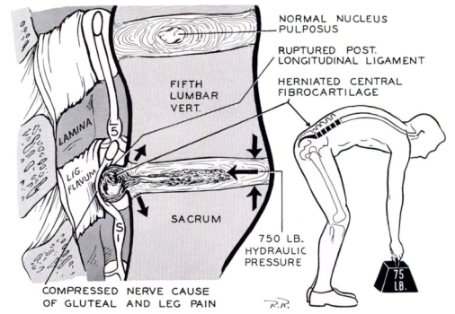
Image from J. Keegan’s paper
In 2001, Jack Callaghan and Stuart McGill performed experiments on pig spines. With each flexion and extension of the spine, they could see the disc material traveling towards the back. Given enough flexion cycles, they were able to break discs even when the compressive force was moderate, on the order of 100 kg.
Lack of motion. Intervertebral discs are made up of living cells and they need to receive nutrients and get rid of waste products. Regular exercise appears to enhance this, possibly by improving microcirculation at the edge of the disc. In 1983, Sten Holm and Alf Nachemson found that, in dogs that exercised regularly over three weeks, intervertebral discs were more efficient at absorbing substances and expelling waste products than in dogs that were more sedentary (disturbingly, to acquire this result, 21 labradors had to be killed by lethal injection and their spines extracted and examined in vitro). Interestingly, the effect appeared only if exercise was carried out over the long term, which suggests that disc nutrition is not some simple mechanical result of movement, such as changes of pressure in the disc. (Here’s a recent scientific review on disc nutrition for more on this topic.)
But is sitting in itself bad or your back, or is it perfectly healthy to sit for 8 hours a day as long as you also get regular exercise? The jury is still out, but the best evidence we’ve got suggests that people who sit a lot do not appear to have a higher likelihood of experiencing back pain. (However, there is more and more evidence that sitting hurts your body in other ways – for example by increasing your risk of certain cancers – regardless if you exercise. Paul Ingraham has a nice overview of the risks of sitting.)
In short, sitting by itself probably doesn’t harm your back, provided that you get enough exercise. Far worse than sitting is bending your back while lifting heavy objects or doing exercises like sit-ups or deadlifts. In fact, as noted by Stuart McGill here, couch potatoes often have pain-free backs; it’s the people who work their butts off in the gym that are often crippled with pain.
What to do?
Here’s my list of recommendations for computer workers who want to prevent back problems. (Once again, I’m not a medical professional, so take it with a grain of salt.)
- Don’t bend your back, especially under load.
- Be more mobile.
- When you sit, change your position often.
- Learn to sit in your chair properly.
- Get more exercise, especially back-muscle exercise that doesn’t bend your spine.
- Learn to lift things safely.
- Have a good chair (see“How to buy a good ergonomic office chair”).
How can I be more mobile?
Taking breaks can make an enormous difference, as it gives your spine (and your whole body) a chance to “catch a breath” and regenerate a little before you plant it in front of your computer again. For each activity that you do in the course of your day, ask yourself: do I have to be sitting while I do this?
- Do you have to be sitting when you’re on the train to work?
- Do you have to be sitting while you have your breakfast?
- When you get a phone call at work, do you have to take it in your chair, or can you walk around the room as you talk?
- If you need to talk something over with a colleague, do you have to be sitting or can you both take a short walk down the hall?
Just being on the lookout for opportunities to stand or walk around can make a significant difference. If that’s too minimalistic, the next step up from that is to get an exercise ball (AKA gym ball AKA Swiss ball) and sit on it for 15-30 minutes a day. Sitting on a Swiss ball is great because:
- it keeps your spine moving – it’s impossible to sit motionless on a ball
- it strengthens your back muscles (which is good because strong muscles can help you maintain proper spine alignment – more on that later)
- it’s fun (you can bounce!)
- you can work on your computer as you do it – as long as you don’t think sitting on a huge inflatable ball is embarrassing
At much greater expense, you can get a standing desk and use it for an hour or so every day. Standing has the following beneficial effects:
- it puts your spine in a neutral position (although you cannot transfer part of your body weight to the backrest, as you can when sitting)
- it strengthens your back muscles
- it makes you more mobile – (1) because it’s impossible to stand motionless for any significant amount of time, and (2) because it makes you more likely to walk around the room (e.g. when thinking about what to write next) – the transition from standing to walking is more natural than from sitting to walking
It’s probably best not to stand for too long, as prolonged, near-motionless standing (such as you would experience when working at a standing desk) carries its own risks with it. Think of it more as an addition to your repertoire of working positions, not an outright replacement for sitting.
For further reading, check out Paul Ingraham’s overview of what he calls “microbreaking”.
Why should I change my position often?
“What is the optimal seated position?” “The next one.”
Much of ergonomic advice seems to assume (or at least unconsciously promote the assumption) that there is such a thing as the “optimal seated position”. A typical picture shows a person sitting upright or almost upright, with their elbows bent at a 90° angle:
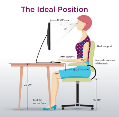
Although this position is good for intensive typing, talking about the “ideal position” is a bit like talking about the “ideal food”. No one food can provide you with all the nutrients, just as no one position can guarantee you a healthy back. In reality, the key to a healthy back is changing your position frequently. The reason for this is that different positions put strain on different parts of the spine.

Sitting in a reclined position takes stress off your lumbar spine. As you increase the recline angle above 90°, you will also start transferring some of your upper body weight onto the backrest of your chair. This reduces the compressive forces acting on your spine.
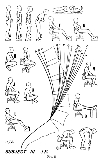
The other reason why a reclined position is easier on your lumbar spine follows from the fact that the natural shape of the lumbar spine is concave, as you can see in the above picture. But when you sit in an upright position, with a 90° angle between your hips and your torso, your lumbar spine is flattened, i.e. bent outward compared with its normal shape. Here are some X-ray-based drawings (from Jay Keegan’s 1953 paper) showing the degree of lumbar flexion in different positions. Notice that the upright seated positions (I J M N) flatten the lumbar spine more than reclined positions, with the exception of L, in which the subject essentially slouched (unlike in F, where the lumbar spine was supported by the chair, and G, where the subject maintained the proper curvature with his muscles).
According to recent research by Nadine Dunk et al., the upright seated position puts the L5/S1 joint (the most failure-prone part of the spine located where the lumbar spine meets the sacrum) at 60% of its maximum range of motion. The flexion is even worse if you sit like the guy on the right.
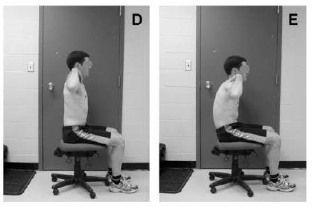
Image from Dunk et al., Evidence of a pelvis-driven flexion pattern…
This flexion of the lumbar spine in the upright position puts additional pressure on your intervertebral discs (see “What causes an intervertebral disc to break?”). Your lumbar vertebrae are in the best (neutral) position when you are reclined at 135°. However, nothing comes free. A reclined position puts strain on your cervical (neck) spine and the associated muscles, because you have to bend your cervical spine to keep your gaze on the monitor – and, by the way, the cervical spine is the second most common site of spine injuries. A reclined position also makes it harder to type on your keyboard, potentially leading to dangerous wrist and hand injuries.
In short:
- sitting reclined relieves your lumbar spine, but stresses your cervical spine
- sitting upright relieves your cervical spine, but stresses your lumbar spine
Changing your position balances things out, giving each section of your spine time to regenerate before something bad happens. To do this, you need two things: (1) a chair that enables easy position changes (more on how to buy a good chair), and (2) a habit of changing positions frequently. One technique that I find helpful is to recline in your chair whenever you’re not typing – for example, watching a YouTube video or reading some webpages.
How do I sit on my ergonomic chair?
The #1 mistake is not adjusting your chair:
- Height – should be set so that your thighs are roughly parallel to the floor.
- Backrest tension/resistance – should be set so that you are supported in your working position, but can recline without too much effort if you want to.
- Seatpan depth – should allow you to sit your butt all the way back without falling into a “hole”; it should not come up to your knees (in fact, it’s all right to leave a lot of space between the seatpan and your knees) (see below)
- Lumbar support height – Make sure the lowest part of the lumbar spine (L4-L5) is well-supported – 95% of all disc herniations occur at L4-L5-S1, so protecting that area is vital. To locate it, reach to your back and feel the top edge of your pelvis (posterior iliac crest). You can also try to feel the first vertebra that comes out of your sacrum (it’s easier to do this when bending over). If the lumbar support is set too high, it can leave a gap and allow the lowest part of the lumbar spine to flex. If your chair’s lumbar support doesn’t go low enough (this is more likely to be the case for smaller users), consider sitting on a cushion.
- Lumbar support depth – should be adjusted to fill the small of your back. Pay attention to comfort, but err on the side of more aggressive support – the consequences of an insufficient lumbar curve are more serious than those of an excessive one.
- Armrests (if you’re using them) – should be slightly (less than 1 cm) below desk level.
The #2 mistake is not having proper contact with the backrest. Your back should be as far back as possible. If you leave empty space between your back and the backrest, you’re making it possible to slouch. If your seatpan allows back–forward adjustment, make sure it is as far back as necessary to fully support your butt.
Plant your feet flat on the floor. Stretching your legs in front of you is OK as a brief break, but it will pull your upper thighs forward and up (the edge of your seat will act as the fulcrum). Since your thighs are attached to the bottom part of your pelvis, and the rear part of the pelvis is weighed down by your entire upper body, the pelvis will rotate backward (meaning that the top part of your pelvis will move backward). Since your spine is attached to the top part of the pelvis, this backward motion will push out your lumbar spine, which is connected to the top part of the pelvis. This is exactly what you want to avoid.
What kind of exercises can I do?
Being sedentary is bad for your back because it starves and weakens your intervertebral discs. But much worse than that is exercising improperly. The link between sitting and back problems is indirect; the link between flexing your back and back problems is obvious and direct. That is why it makes sense to avoid bending your back when exercising – this means no more exercises like sit-ups (including hanging sit-ups), crunches, deadlifts, pulling your knees to your chest, bending over to touch your feet, etc. As long as you follow that rule, any moderate form of exercise will probably be good for your back, whether it’s walking, swimming or running.
Whether or not we spare our backs in the gym, we all have to flex them in our daily lives. We have to lift heavy objects like chairs, bend over to pick something up, put our shopping bags into the trunk, etc. All of those movements add up to cumulative damage. It’s possible to do these everyday activities in a way which puts less stress on your spine. This requires two things:
- the proper technique (more on that later)
- strong muscles that are able to hold your back in a healthy position
#2 means that it’s a good idea to strengthen your “core” (your back and abdominal muscles) through exercises. Fortunately, you can achieve great results with back-safe exercises which don’t involve flexing your spine.
Probably my favorite exercise is “stir the pot“, which not only seriously challenges your abs, but also doesn’t make you flex your lumbar spine. The only disadvantage is that it requires a stability ball and reasonably good balance, as you could hurt yourself if you slide off the ball.
Stuart McGill recommends a trio of exercises which is called the “McGill’s Big Three”. Like “stir the pot”, these are designed to strengthen your core while sparing your back.
- Curl-up
- Side bridge
- Bird-dog
All the exercises discussed above are demonstrated by Stuart McGill in this video:
Here are some individual videos for the curl-up, side bridge and bird-dog.
Another exercise I really like is kneeling on an exercise ball. It looks like this:
You’re supposed to just kneel like this, with your arms down your sides, for something like 10 minutes. This works your entire core because you have to constantly correct your balance with either your abdominal muscles or your back muscles (if you are mostly using your leg muscles or your arm muscles, you’re doing it wrong). It looks easy when you watch YouTube videos made by fitness pros, but if you don’t have a great sense of balance, it will be fiendishly difficult to stay on for even a couple seconds. The best way to do this exercise for the average Joe is the way recommended to me by my physical therapist:
- Use a table to get onto the ball. All the videos on YouTube show people getting on the ball without extra help, but this is challenging even for a fit person, and increases the probability of an accident (e.g. bumping your head on something).
- Kneel next to a table or some other object which you can grab if you start to lose your balance. Start by kneeling with both of your hands on the table; as you get more confident, take one hand off, or use only one finger.
- It’s easier to do this exercise if your Swiss ball has less air in it.
- Start with just a few minutes, then work your way up. You can overload your muscles if you do it for too long.
This exercise is probably not recommended for people with impaired balance and/or fragile bones, as it’s possible to hurt yourself when you fall off the ball (and you will fall off a lot, trust me). It is also necessary to make sure there are no objects with sharp edges around you that you could fall on.
I like this exercise for two reasons: (1) I can watch stuff on my computer as I do it, (2) it gives me a feeling of progress, as I can really feel my back muscles getting stronger and my balance getting better. I went from less than 2 seconds (essentially falling off the moment I took my hands off the table) to over 5 minutes.
How do I lift things safely?
- Keep the object as close to your body as possible. The further away the object, the larger the force that’s crushing your vertrebrae together. Lifting an object weighing 10 kg in a stooped position places 100 kg of force on your back due to the mechanical disadvantage of your back muscles.
- Avoid picking up heavy objects from the ground – this forces you to bend over excessively. Try to grasp objects as high as possible. If necessary, tilt them into a position that allows you to grab them higher. Don’t put objects on the ground if you’re going to have to pick them up again.
- Try to split heavy objects to avoid carrying them in one go.
- Avoid twisting your back. Your back can take much more when it’s straight. If you’re going to lift something, make sure it’s right in front of you, not to your left/right (which would force you to twist your torso). When moving around, make turns with your feet. Your hips and your trunk should move as a single unit.
- Don’t lift shortly after getting up in the morning. Intervertebral discs contain more fluid in the morning (as a result, you are actually taller when you get out of bed), which increases the risk of injury.
- Don’t lift immediately after prolonged sitting or stooping. Having your back flexed deforms your discs. They need some time to regain their shape before you subject them to loads. Spend a few minutes walking or standing before you start lifting.
- Lock your lumbar spine in the neutral position, in which it is most resilient, and bend your hips and knees instead (see photo and video below). Your knees should be roughly above your feet (you should sit “back”, not “down”). When lifting, pull your hips forward while pulling the weight up your thighs. This is how Olympic powerlifters do it (if they didn’t, they would all be in wheelchairs). It does not come naturally, so don’t just read about it – go ahead and practice at least a couple times. You’ll also need strong back muscles to stiffen your back for this technique.
- When lifting light objects off the floor, use the “golfer’s lift”, which keeps your spine straight (see photo below).
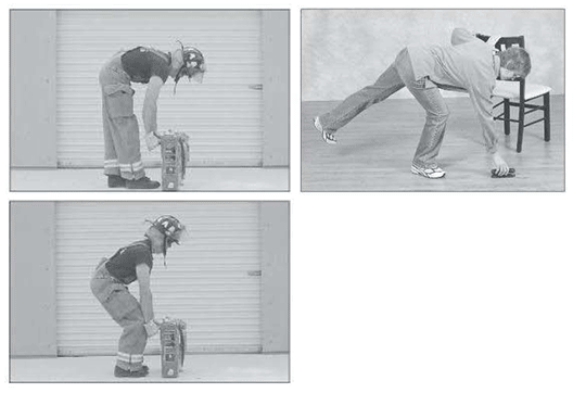
(top left) incorrect lifting form with lower back flexed; (bottom left) correct form with bent hips and knees; (top right) spine-conserving “golfer’s lift” [images from Low Back Disorders by S. McGill]
What kind of chair should I sit on?
Read my article: “How to buy a good office chair”