It was 7 years ago that I last bought a display for my desktop PC. The display I picked then – the Dell 2209WA – is still kicking, although it has begun to show signs of advanced age. The CCFL backlight has yellowed and dimmed, and the panel now has a weird dark smear in its left half. It is a display that doesn’t believe in climate change, happily guzzling 50 watts of power and giving off enough heat to make the entire backplate hot to the touch.
So far, my display strategy has been to hold off on an upgrade until someting really great comes along. “Maybe this year we’ll finally get affordable OLED displays? Maybe this is the year that Windows gets proper support for Retina screens?”, I would think, every year – until I got tired of waiting and decided to order the Dell U2415, a display that Wirecutter has singled out as the best 24″ monitor. I admit one of my reasons was curiosity – I wanted to see how much display technology has improved in 7 years. With so many commenters gushing over the picture quality on the U2415, maybe I was missing out?
If you’re looking for a full-fledged review of the Dell U2415, I will refer you to TFTCentral’s review. Here, I’m going to do something that is hardly ever done in online reviews: compare the U2415 with its much older brother, the 2209WA.
Physical features
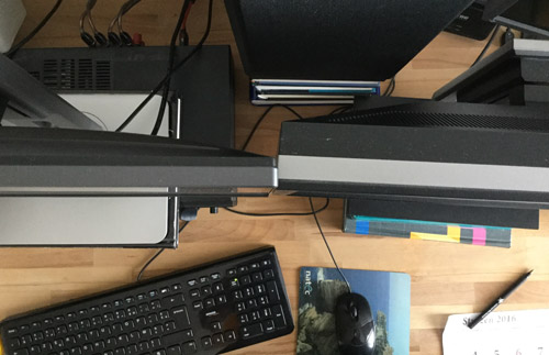
The U2415 is a much slimmer, lighter device than the 2209WA. The degree of miniaturization brought about by innovations like LED backlights is immediately apparent when you compare the two displays side by side:

Both displays have good build quality, but the U2415 comes out on top due to its impressive thinness and a sturdy-feeling stand that allows a higher range of vertical adjustment. I am, however, not a fan of the touch-buttons on the U2415. In a dark room, you can’t see the faint dots that mark the touch-sensitive sensors, and trying to find the brightness button with no physical edges to guide your fingers is an exercise in frustration. You end up poking at the bezel several times until you finally hit the right place.
Power, noise, heat
The 2209WA was like a mini-space-heater, while the U2415 barely gets warm, even on maximum brightness (and its maximum setting is quite a bit brighter than the 2209WA). The official power ratings for “typical use” (52 W for the 2209WA and 23 W for the U2415) don’t do justice to the night-and-day difference between the two monitors. I suspect Dell used a bit of creative measurement to arrive at the 52W for the 2209WA, as the display feels much hotter than that in everyday operation.
An additional point in favor of the U2415 is that the 2209WA needed up to 20 minutes to get to its normal brightness, while the new model pumps out the photons the moment you turn it on. Chalk one up for LEDs.
The 2209WA makes a slight buzzing noise that can occasionally become audible in a quiet room from a normal viewing distance, depending on the brightness setting and the picture on the screen. The U2415 appears to be dead silent.
Picture quality
Perhaps the biggest disappointment is that the 7-year gap between the two displays did not result in an appreciable improvement in image quality. While on paper the U2415 has better coverage of the sRGB color space, in actual side-by-side comparisons using familiar photos and movies, I struggled to find a difference, other than slightly higher saturation on reds and a slightly better black level on the newer model.
Text on both displays was equally sharp. However, the U2415 has a 4% smaller pixel pitch than the 2209WA, which means that (at the same font size) everything will appear smaller and harder to read, as every letter is 8% smaller in terms of area. It might not matter to you if you’re a twentysomething with perfect vision, but I definitely noticed a drop in readability. When I put the two displays side by side, I strongly prefer reading text off the 2209WA. In theory, you can increase the font size to suit your preference, but in practice, this doesn’t work for system fonts (unless you use system scaling with all its problems) and – as any Web designer will tell you – not all fonts look good if you make them 1 pixel taller due to the inherent inaccuracies of the pixel matrix.
In the uniformity department, the venerable 2209WA is the clear winner. First, it has very little backlight bleed, whereas the U2415 has a somewhat distracting patch of light in the upper-left corner, which is visible even on near-zero brightness when viewing a dark scene in a movie or a videogame. While on low brightness the flaw is not very serious, as it is overshadowed by “standard” IPS glow, on higher brightness settings it begins to detract from the viewing experience, especially with movies (which on a 16:10 panel always have black bars that expose backlight bleed defects near the edges). Of course, it’s probably possible to get a unit with less backlight bleed if you have the patience to play the panel lottery enough times.
Second, both displays exhibit similar levels of IPS glow, although on the U2415 the effect is more noticeable on account of its larger size.
Third, the U2415 has much worse viewing angles than the 2209WA. This can be easily seen when looking at the two monitors at roughly the same angle:

(The results are the same when looking at a horizontal angle.)
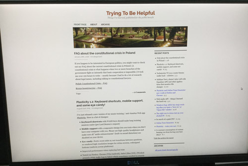
It would all be well if the issue only arose with sharp viewing angles, but even at a normal viewing distance of 50-60 cm, the far sides of the U2415 (and especially the corners) are slightly darker (and cooler) than the middle part. This results in a kind of vignette effect that does not go away no matter how you tilt the screen. It’s not a big deal when you’re watching movies, but when viewing pages of text, the text at the bottom has noticeably lower contrast (and lower readability) than the text closer to the center of the screen:
Notice that the background gets darker not just in the corners, but also in the whole bottommost part of the screen.
Moreover, if you look at a single point on the screen and move your head about 10 cm in any direction, you can clearly see the background changing color (getting cooler/darker or warmer/brighter). Although you can notice the same effect on the 2209WA if you look really hard, I was never conscious of it in my years of use, while on the U2415 it jumped out at me immediately. After 3 days of working on the display, I still find it slightly distracting.
The anti-glare coating on both displays is very similar. It’s not perfectly uniform, like the coating you’ll find on many higher-priced monitors, but – subjectively – not grainy enough to distract from what’s displayed.
Response time / motion
Both displays operate at 60 Hz and offer similar response times. Neither is equipped with any kind of adaptive sync technology.
My subjective conclusions
It looks like seven years is no longer an eternity in the world of technology. With all that time separating the two monitors, I am not entirely sure that changing the Dell 2209WA to the U2415 can be considered a clear-cut upgrade. Sure, you get a bigger, more power-efficient, cooler-running screen, but you lose some picture uniformity due to the “vignette effect” and, probably, heavier backlight bleed (depending on how lucky you are). When I also consider the drop in reading comfort due to the smaller pixel pitch on the 24″ display, I’m starting to ask myself the question, why exactly am I spending $300 (European prices) on this? It seems more reasonable to wait for a good 4K screen – something like a successor to the Dell P2415Q without the chronic resume-from-standby issues and sharp scaling of 1080p sources.


Instead of waiting for the HiDPI support in Windows to become good enough (not going to happen for another few years), you should do what I did two years ago and switch to the operating system now known as macOS. I’m happy to say that the HiDPI support in macOS has no issues whatsoever.
Thank you for this comparison. I also have the 2209 that is aging and have been wanting to upgrade to the U2415 thinking I’m missing out. Clearly the 2209 can still compete.
Very, very interesting, I also felt this would be a good upgrade from my 2209 but will not make this jump and wait until I upgrade from my gtx 970, then ad a more expensive model that recommended on TFT Central.
I’ve checked countless displays after trying to switch from 2209WA (I still have three of those and they’re all performing great, especially uniformity is top-notch).
Unfortunately the bigger the display the bigger the uniformity, also I never came across a display that is factory calibrated good enough to replace 2209WA. So for example I tried NEC MultiSync EA275WMi (almost $1000 in Europe at the time of buying while 2209WA was more like $200!) and it was much worse, uniformity was awful, banding was easily visible (there is no banding on 2209WA at all), the quality of the stand and build quality were much worse etc.
What I’m going to say it’s going to be painful but if you, dear reader, are looking for 2209WA replacement you have to spend much more money today than you paid for 2209WA all these years ago.
There are not many 16:10 screens anymore and you’re looking only at EIZOS and NECs. The cheapest upgrade is NEC 245wmi-2-ct at around $530. DO NOT GO FOR the version without -CT, which is roughly $400. CT (ColorTuned) is already calibrated and much better than 2209WA. The version without CT is much worse. If you get any not ColorTuned NEC you have to pay for additional calibration ($50-$100 depending where you live). With EIZOs you also have to pay for the calibration.